
An AI design workflow that keeps human judgment in charge
Use generative tools to explore directions without losing the brief, accessibility or a coherent visual system.
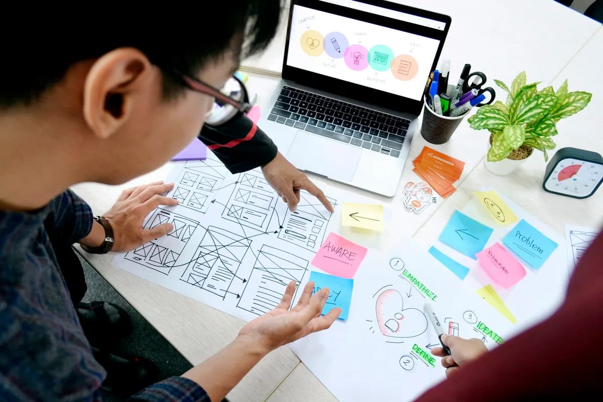
AI can produce many visual options quickly. That is useful for exploration, but quantity is not a design decision. A good workflow makes the brief, the audience and the usability check visible throughout the process.
1. Define the problem before the style
Describe what the page or asset must help someone do. Name its audience, context, mandatory content and constraints. Gather real examples of tone, layout and imagery, then explain what works in each example rather than asking a model to ‘make it premium’.
Choose one primary action per screen. A striking composition that hides the next step is not finished design.
- Write the user task in plain language.
- List content that must remain legible.
- Agree on what should not be generated or invented.
2. Explore, select and build a system
Generate a small number of genuinely different visual directions, not dozens of near-duplicates. Compare them against the brief: hierarchy, contrast, tone and how well they scale to mobile.
Once a direction wins, turn it into rules: type scale, spacing, colors, imagery and component behavior. Use AI outputs as raw material, not as a substitute for a design system. Keep important text as actual HTML text, not embedded in an image.
- Choose by the brief, not by novelty.
- Check mobile and long-content layouts early.
- Document reusable tokens and components.
3. Test with people and accessibility in mind
Check keyboard navigation, focus visibility, color contrast, labels and text alternatives. The W3C WCAG quick reference is a useful standard to consult, but a checklist cannot replace testing the actual interface with real tasks.
Ask someone unfamiliar with the design to complete the primary action. Note where they pause, where they misread a label and what they expect to happen next. Revise the system, then retest.
- Can the main task be completed without a mouse?
- Do images have the right alternative text?
- Does the page still make sense at a narrow width?
Start with one screen. Write its job, compare three directions, build one coherent set of rules and test the action on mobile before polishing the details.